
Fitness equipment designed for all environments
The client's objective was to create an approachable machine with improved user interface
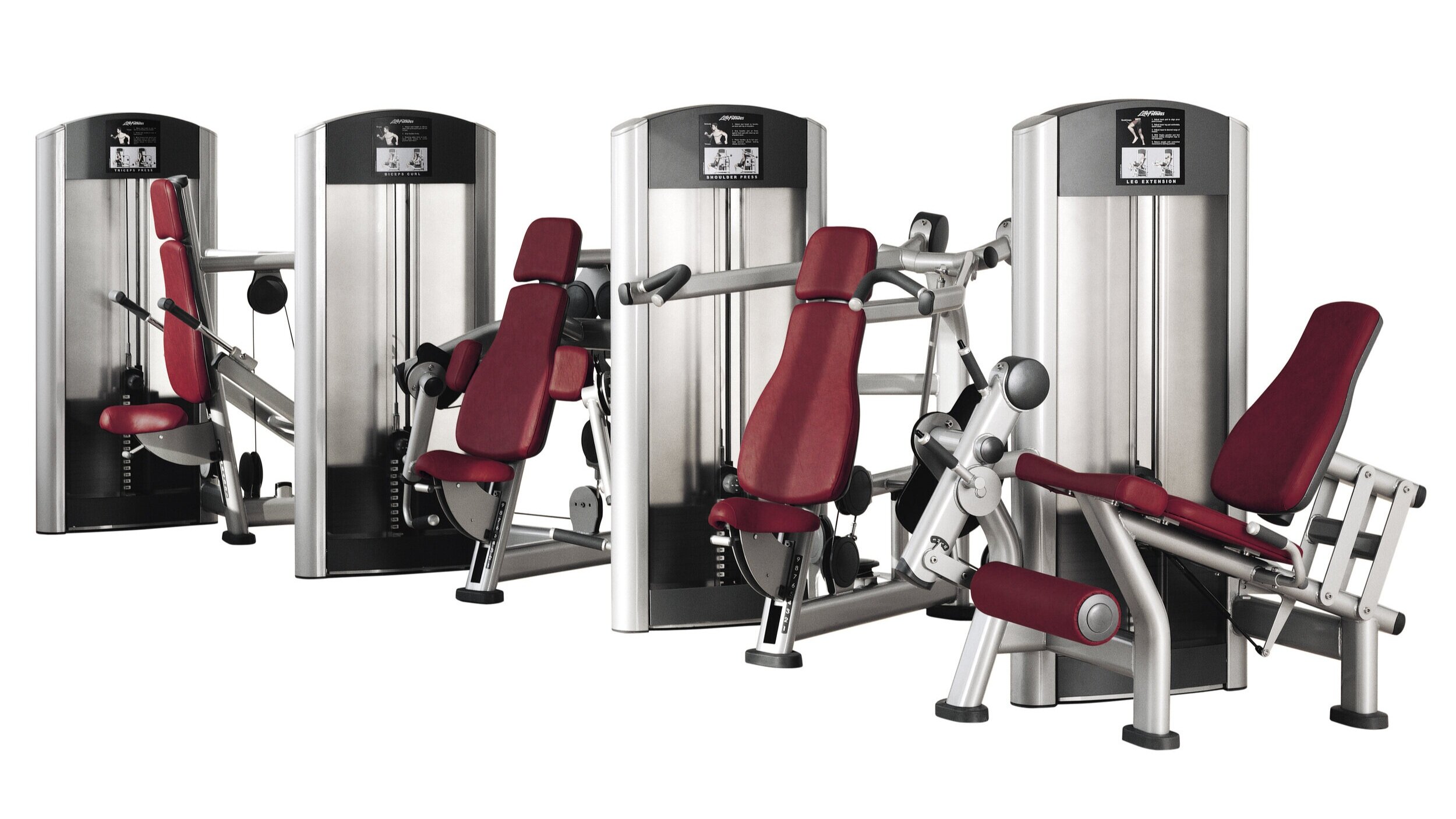
Life Fitness - Signature Series Strength Machines
Awards:

Project Description:
In response to health clubs investing heavily in the visual and emotional impact of their facilities, Life Fitness wanted to develop a new brand identity for their new commercial strength machine product line. The client's objective was to create an approachable machine with improved user interface.

Instructional plaques designed for each machine illustrate how to use the product and the muscle groups being worked. User interface design components like the handle, lever and knob share common aesthetic details, color breakups and materials. This design strategy is implemented into over 15 different product iterations. As a result, the learning curve is shortened when moving from one machine to another.

Visual brand recognition is established through a balance of scale, proportion and form that creates approachable strength machine products. The overall silver and chrome color selection lightens the form to reduce the level of intimidation.

Soft shapes and tube locations open the user area making it less confining. The pulley used to guide the lifting cable and pivot points are covered with plastic. These plastic covers make the machine more inviting with a clean integration of functional elements.


